React and Tailwind CSS simple progress indicator
I believe that a website or app's progress indicator should respect the global theme and have a touch of originality. That's why I never use an external library or package for it. I prefer to create my own component, keeping it as lightweight as possible and fully customizable.
With React and Tailwind, it's a piece of cake. Let's break it down into two separate components, called `LoadingSpinner` and `Loading`.
The source code and a working example can be obtained from this repository.
The "LoadingSpinner" Component
This component is the visual spinner in motion. It's a flex container with a fixed width and the aspect-square utility to keep it square. The content, which could be an icon or any element of your choice, is centered both vertically and horizontally, and animated using the animate-spin utility.
import { PropClassName } from '@/types/typesGlobal';
import { FaRadiation } from 'react-icons/fa6';
import { twMerge } from 'tailwind-merge';

export interface LoadingSpinnerProps extends PropClassName {
    flavor?: keyof typeof flavorCss;
}

const flavorCss = {
    lime: 'bg-lime-400 border-lime-300 outline-lime-200',
    orange: 'bg-orange-400 border-orange-300 outline-orange-200',
    rose: 'bg-rose-400 border-rose-300 outline-rose-200',
    sky: 'bg-sky-400 border-sky-300 outline-sky-200',
} as const;

const LoadingSpinner = ({ flavor = 'rose', className = undefined }: LoadingSpinnerProps) => {
    return (
        <div
            className={twMerge(
                'flex items-center justify-center w-8 aspect-square text-lg text-white rounded-full border-4 outline-4',
                flavorCss[flavor],
                className
            )}
        >
            <FaRadiation className="animate-spin" />
        </div>
    );
};

export default LoadingSpinner;
The "Loading" Component
This component is also a flex container. While optional, it is quite useful when the spinner needs to be centered vertically and horizontally (by default) within a specific area. Its main purpose is to avoid repetitive wrapping code.
These components should also be highly customizable with minimal effort. You might be tempted to add numerous properties to control colors, sizes, or other aspects. However, thanks to Tailwind, we can simply apply CSS classes to drastically change the appearance of the spinner.
The only compromise I made was to preset the colors, as they involve three elements: the background, border, and outline.
import { PropClassName } from '@/types/typesGlobal';
import { twMerge } from 'tailwind-merge';
import LoadingSpinner, { LoadingSpinnerProps } from './LoadingSpinner';

interface LoadingProps extends PropClassName, LoadingSpinnerProps {
    spinnerClassName?: PropClassName['className'];
}

const Loading = ({
    className = undefined,
    spinnerClassName = undefined,
    ...rest
}: LoadingProps) => {
    return (
        <div className={twMerge('flex-1 flex items-center justify-center', className)}>
            <LoadingSpinner {...rest} className={spinnerClassName} />
        </div>
    );
};

export default Loading;
Note that the "Loading" component has two different className props: "className" and "spinnerClassName", allowing you to customize the "Loading" component itself and the "LoadingSpinner" independently. Otherwise, they share the same props.
About "PropClassName"
You probably noticed that the "LoadingProps" and "LoadingSpinnerProps" interfaces extend the same type, "PropClassName." This is a shorter way to reference the HTML element attribute "className."
import { HTMLAttributes } from 'react';

export type PropClassName = Pick<HTMLAttributes<HTMLElement>, 'className'>;
Usage
These examples will show you how to use these two components and demonstrate how easy it is to customize them with a few Tailwind class utilities.
// Default
<Loading />
// ...or
<LoadingSpinner />
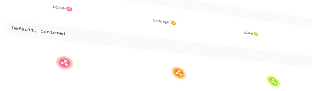
// Default with a predefined color
<Loading flavor="lime" />
// ...or
<LoadingSpinner flavor="lime" />
// A lighter and smaller version for inline display
<LoadingSpinner className="w-4 text-xs border-0 outline-0" flavor="sky" />
// A bigger version
<Loading spinnerClassName="w-20 text-6xl" flavor="rose" />Conclusion
As we can see, it's simple to implement a reusable and versatile "loading" component in React with a little help from Tailwind. Don't hesitate to add custom colors or modify the basic components to better suit your needs.
About the author
Front-end developer focused on React, Next.js, and clean, scalable CSS. Once building in PHP, Flash and others, now crafting layouts that (mostly) behave as expected. Greg's background in web design (Photoshop, Illustrator) shaped his love for clean layouts and CSS details. This blog is his way of giving back-sharing what he has learned from the same community that keeps inspiring him.